
Small Event Backdrops: Keeping Sponsor Logos Clear of Frames and People
A backdrop is usually approved as a full rectangular design, but guests rarely see that whole rectangle in photographs. People stand in front of the centre, a support frame can hide the edge, and the event photographer may crop out the top corners. A logo that appears perfectly placed in a desktop mockup can vanish behind a shoulder or be clipped by the stand. Good backdrop design begins with the actual venue, camera position and likely group size—not simply the largest printable dimensions.
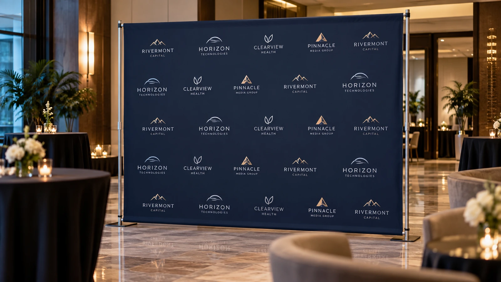
Measure the usable scene, not just the nominal backdrop
Ask for the finished visible width and height after the chosen mounting hardware is installed. The dimensions on a product listing may refer to print material, frame span or finished graphic area. These are not interchangeable. Consider the available floor space, ceiling height, nearby windows and distance from the camera. A huge graphic can feel cramped if there is no room for people to stand far enough forward.
Photograph the venue position with a person or chair for scale. Mark where guests are likely to stand and how many should fit in the frame. If the backdrop is used for an award presentation, the main subject may be near the centre; for a photo booth, groups will move across the whole scene. The artwork should be composed around realistic use instead of one empty studio rendering.
Build a hierarchy for sponsor and event information
Start with the information that must be visible in photographs: the event identity, principal sponsor or organising body, and perhaps a short supporting line. Repeating many small logos across every square centimetre often weakens the visual impact. A carefully spaced pattern may suit a media wall, while a stage backdrop may need one strong central message positioned above the people standing in front.
Check contractual logo obligations separately. If every sponsor requires equal treatment, establish an agreed grid and minimum legibility size before making the design. Do not shrink dozens of logos into an unusable row simply to keep the layout symmetrical. Ask organisers which marks need to remain readable from audience distance and which are intended mainly for close-up photographs. The hierarchy should reflect those requirements honestly.
Protect against people covering the artwork
A group will obscure the middle and lower regions of the backdrop. Place the key title or major brand elements high enough to clear heads without sending them so close to the top that framing cuts them off. Consider a repeated but restrained brand pattern at shoulder height rather than relying on one mark behind the central speaker. Test the design with silhouettes representing a realistic mixed-height group.
The safest composition depends on how photographs are taken. A close-up two-person award photo crops more severely than a wide group shot. Make two simple mockups of the expected camera framing and evaluate both. If the mark is hidden in one view, either reposition it or accept that the graphic serves a different purpose. It is better to establish expectations before print than to complain after the photographs are delivered.
Account for frames, hems and mounting clearance
Backdrops may use pole pockets, eyelets, sleeves, clamps or tensioned frames. Each method changes the area where artwork should be protected. A folded hem can cover a coloured edge; a stand leg may obstruct a lower corner; a fitted fabric display can stretch graphics around the side. Request the finishing diagram for the chosen hardware. Do not put a date, website or sponsor mark directly inside a region that will be folded or clamped.
Large gradients and photographs also need adequate print resolution at physical dimensions. Assess the source files at final size rather than trusting a small social-media image. For a repeated sponsor pattern, supply vector logos where available. Check for low-resolution raster marks before layout approval. Ask how the producer expects the file to be delivered and whether any scaling or seam allowance is required.
Design for the room lighting and the camera
Bright stage lights and camera flash can create reflections or overexpose pale colours. A dark navy backdrop may photograph well with white sponsor marks, but it could lose shadow detail in a dim room. Test colour combinations under roughly similar lighting and avoid small thin text. If the backdrop is placed near a window, the exposure may change throughout the event. Consider whether a matte-looking surface would help control reflections.
Stand a person in front of a small sample or projected layout and take a phone photograph from the intended distance. Do not judge only by zooming into the artwork. If the background is very busy, faces and clothing may blend into the design. A clear visual field behind subjects usually supports more professional event photos. Decorative texture should enrich the identity, not compete with the participants.
Prepare a handover and setup checklist
The print order should include visible dimensions, material, frame type, finishing, artwork version, venue and setup responsibility. If a frame is rented, confirm exactly what hardware is included and who installs it. Ask whether the printed graphic will be folded, rolled or packed with a protective tube. A large material can crease or scuff in transport even when the printed file is flawless.
JCP lists large-format display and banner printing among its services. Before promising a specific seamless size or mounting structure, confirm the production option and available hardware. At the venue, check tension, level, lighting and floor clearance before the first photographs. Keep a visual reference showing the accepted final position; it helps if the backdrop must be installed again at another location.
Frequently asked questions
Where should the main logo sit on a photo backdrop?
Place it where it remains visible around the expected people and camera crop. There is no single universal position for every event and group size.
Is a repeating logo wall always better?
No. A repeating pattern is useful for media photographs, but a clean large title may work better for a stage or ceremony.
How much bleed does a backdrop need?
Follow the producer’s template for its material and finishing. A pole pocket, eyelet hem or tension frame may require different allowances.
Can I send the same file to different stand suppliers?
Not safely without rechecking. Hardware and visible area can differ, so adjust the layout to the confirmed display system.
Before you approve the order
Before printing, create a camera-view proof with actual group silhouettes and the intended stand. Check the critical marks in a wide shot and in a tighter two-person crop. Confirm the finishing diagram and final visible area. A backdrop succeeds when the event looks good in photographs, not merely when the raw design file fills a rectangle.