
Logo Printing on Bottles and Tumblers: Measure the Usable Area Before Scaling Artwork
A bottle may be 70 mm wide, but that does not mean a 70 mm logo will sit cleanly on its front. Curvature, taper, handles, lids and the decoration method all reduce the truly usable branding area, so the physical item should define the artwork size.
In This Article
Direct Answer
Measure the actual drinkware at the exact height where the logo will sit and ask for the method-specific printable area. Keep important artwork inside the flattest visible zone, then approve a physical sample from normal viewing distance. Scaling until the logo nearly touches every edge often creates distortion rather than impact.
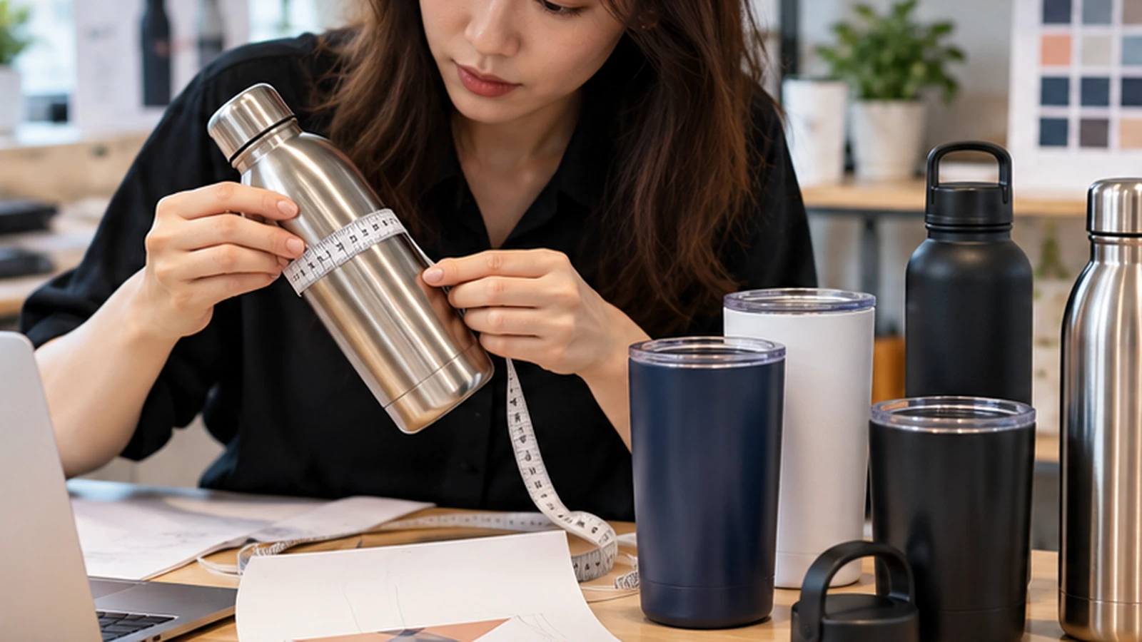
Start With the Product Shape, Not the Artwork
Straight-sided bottles are easier to brand than strongly tapered cups, but even a cylinder presents curvature to the viewer. A wide logo wraps away from the front face, so the left and right ends can become harder to see at once. On a tapered tumbler, the top and bottom circumferences may also differ, which affects how a horizontal design appears.
Before setting dimensions, identify a clear front-facing zone. Measure its width and height physically, then compare those dimensions with the supplier’s printable limits. The smaller of those constraints should guide the design. Mark that front zone with low-tack tape before approving artwork so everyone is discussing the same physical area.
The Decoration Method Sets Its Own Limits
Screen printing, pad printing, UV printing, laser marking and other drinkware methods each have different tooling and printable areas. A laser mark may follow a metal surface differently from a printed colour graphic, while a rotary process may allow more wrap than a fixed front print. The supplier should confirm what the chosen product and machine can actually support.
Do not reuse a size from another bottle merely because the two products hold the same volume. A 500 ml slim bottle and a 500 ml wide flask can have very different usable faces. The method and geometry belong in the same production specification. Ask whether the stated print area is a maximum machine limit or the supplier’s recommended visual area; those are not always the same.
| Product Feature | Design Effect | Practical Check |
|---|---|---|
| Strong curvature | Wide artwork wraps out of view | Paper-size dummy on actual item |
| Tapered body | Horizontal marks can feel distorted | Measure at final logo height |
| Handle | Changes front orientation | Approve left/right-handed viewing |
| Grip sleeve / texture | Reduces usable area | Fit all accessories before approval |
Judge Visual Size From Viewing Distance
On a small object, a logo does not need to occupy the whole front to be visible. A mark with clear negative space can often look more premium than a design pushed close to the sides. If the logo contains small wording, enlarge the wordmark only as far as the curvature still allows it to read naturally. For wordmarks, read the logo while slowly rotating the item: if the first and last letters disappear too early, the artwork is probably too wide.
Print a paper outline of the proposed logo size and tape it to the sample drinkware. Turn the item in your hand and view it from arm’s length. That quick dummy shows whether the design feels centred and whether important elements disappear around the curve.
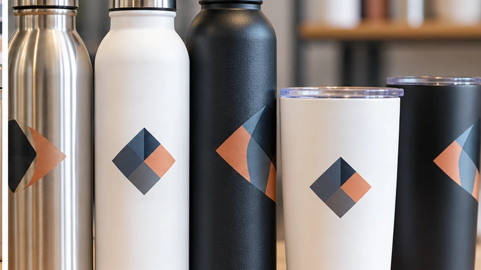
Check Handles, Lids and Grip Zones
Mugs and handled tumblers need a defined viewing orientation because the handle changes what counts as the front. Bottles with large lids, silicone sleeves or textured grip sections can also reduce the available print area. A design that sits comfortably on a plain sample may be partially covered when an accessory is fitted.
Think about how the recipient will use the item. If the bottle is usually held across the centre, a delicate print in that exact grip zone may experience more abrasion. Moving the mark slightly can improve both visibility and wear. On handled mugs, also decide whether the logo faces outward for a right-handed user, a left-handed user or is repeated on both sides; that orientation should be stated in the order.
Approve One Finished Piece Before the Full Quantity
Use the final product colour, final decoration method and final artwork size for approval. Metallic, matte and glossy finishes change perceived contrast, so a black logo that looks strong on a white bottle may feel much quieter on brushed stainless steel. Check edge sharpness, alignment and colour where applicable. If the artwork uses fine lines or small reversed text, include those details in the sample because a method that handles a solid symbol cleanly may not reproduce micro-detail equally well.
Once approved, record the product code, colour, logo dimensions and placement reference. Corporate gifts are frequently reordered months later, and those four details are more reliable than trying to match a photograph from the previous campaign.
The printable area is a production limit; the usable visual area is usually smaller.
Frequently Asked Questions
Can I use the same logo size on different bottles?+
Not safely. Product diameter, taper and decoration method can change the usable area.
Is the widest possible logo the most visible?+
No. Excessive width can wrap around the curve and reduce front-on readability.
What should I record for reorders?+
Keep the product code, colour, decoration method, logo dimensions and placement reference.
Branding Bottles or Tumblers?
JCP can review the product and artwork size before corporate-gift production is confirmed.