
One-Colour Silkscreen Artwork on Dark Shirts: When a White Underbase Is Needed
A one-colour logo can look simple on screen but become much less predictable on black, navy or other dark garments. The key question is whether the visible ink can stay bright enough on its own or needs a white underbase beneath it.
In This Article
Direct Answer
A white underbase is a printed base layer placed beneath the visible colour so the garment does not mute that colour as strongly. Use it when the approved result depends on brightness or colour consistency on a dark shirt, but approve the real print because the extra layer can change feel, setup and registration.
What the Underbase Actually Does
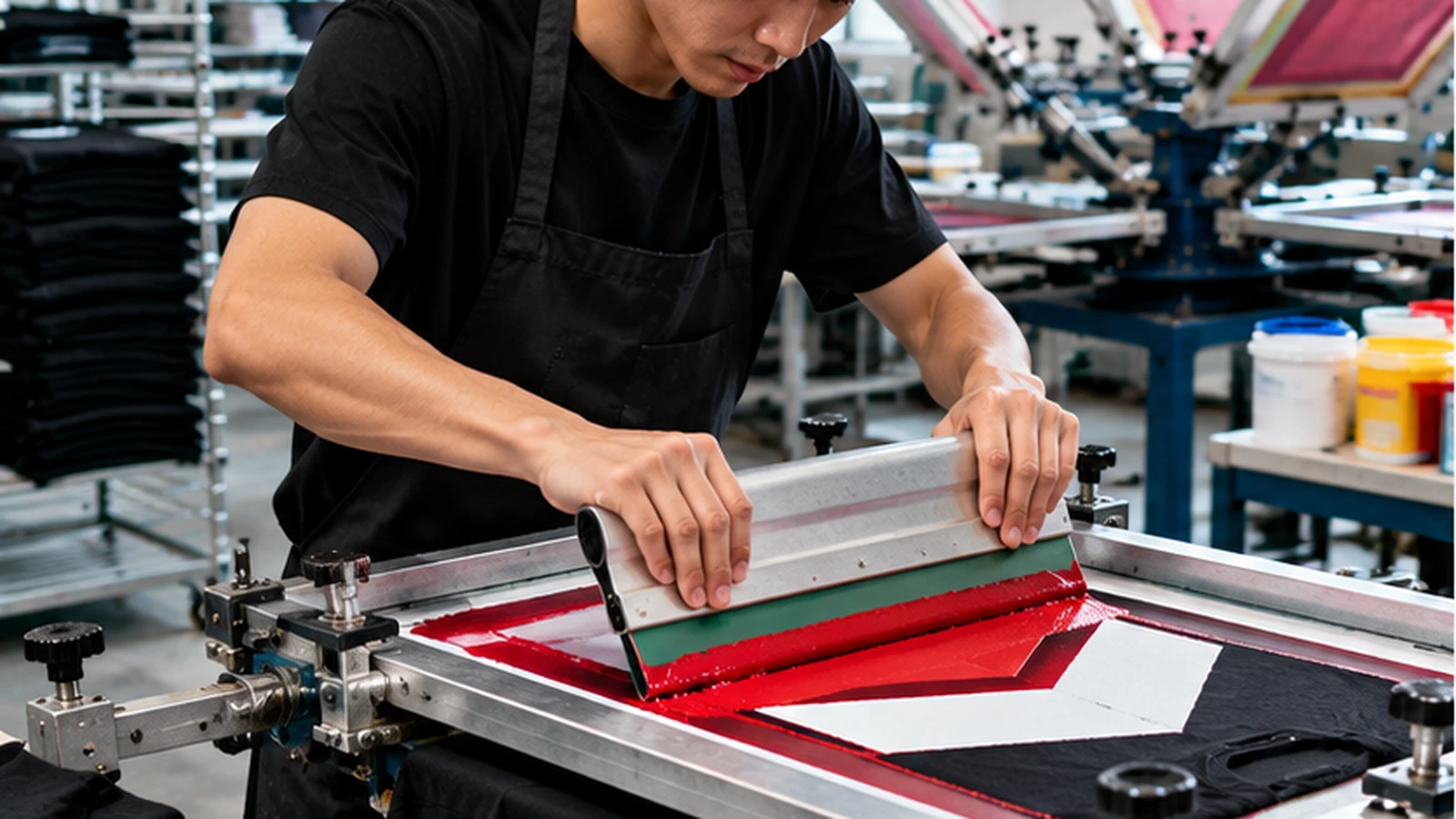
Ink on a dark garment is influenced by the fabric colour underneath it. Some screen-printing inks are more opaque than others, but a red, yellow or light blue printed directly onto black cotton can still look darker or duller than the same ink on white fabric. A white underbase creates a lighter foundation before the visible colour is printed. This makes the top colour less dependent on the garment shade and can bring the result closer to the intended brand colour.
The important production point is that a one-colour artwork may become a two-layer print even though the customer still sees only one final colour. That can affect screen setup, flash curing and registration, so it should be discussed before price and production are locked.
Do Not Judge Ink Opacity From the Artwork File
A vector logo only describes shape and colour values; it does not show how the chosen ink will cover a particular fabric. Two dark shirts can also behave differently if their fabric surface, dye or texture changes. A colour swatch on a monitor therefore cannot prove how opaque the real print will be.
When colour appearance matters, ask for a physical sample on the actual or equivalent garment colour. Compare it under normal indoor lighting and daylight-like conditions. The useful decision is whether the print is visually strong enough for the job, not whether the ink formula sounds technically opaque.
| Scenario | Likely Starting Point | What to Check |
|---|---|---|
| Bright yellow on black | White underbase + yellow top colour | Brightness, registration, hand feel |
| Muted vintage red on charcoal | Direct print may be acceptable | Whether the softer result is intentional |
| Dark ink on white shirt | Underbase usually unnecessary | Coverage and cure |
| Large solid graphic on dark shirt | Test before bulk production | Ink deposit and flexibility |
When Direct Printing May Be Enough
An underbase is not automatically necessary for every dark garment. Very opaque inks, intentionally muted artwork or designs where a slightly softer vintage appearance is acceptable may work with direct printing. A black print on a light shirt obviously has a different problem from yellow on black, so the garment and ink combination matters.
If the design is intentionally tonal, adding a bright white base can actually move the result away from the creative direction. Define the desired appearance first, then let the production test determine whether the extra base layer helps.
What the Extra Layer Changes in Production
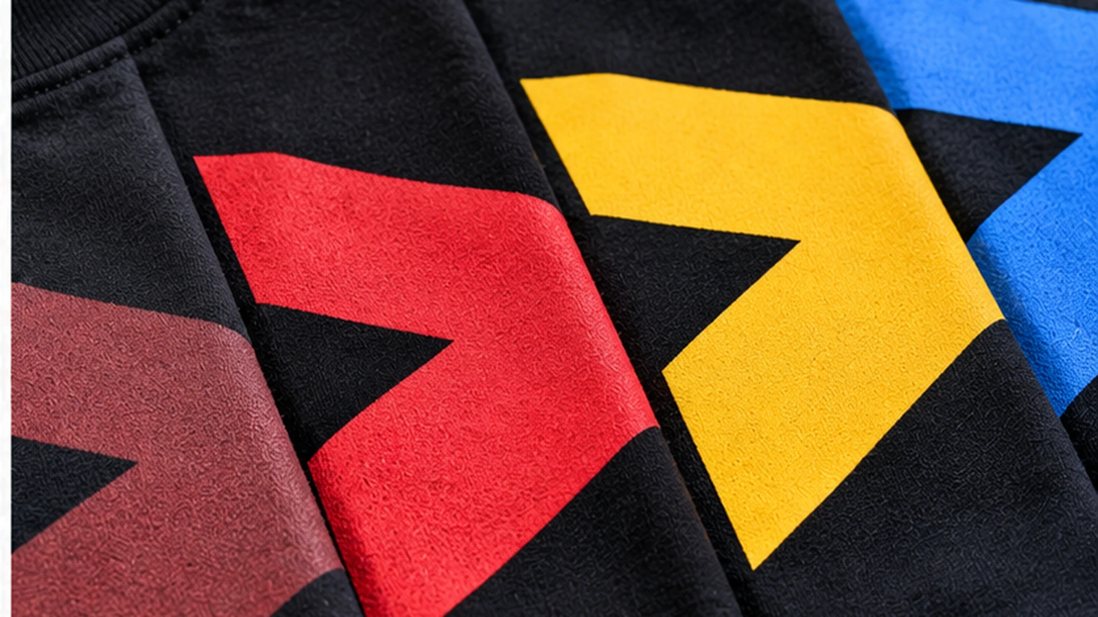
An underbase adds ink coverage and another production step. Depending on the artwork and ink system, the print can feel slightly heavier because there is more material on the fabric. The printer also has to keep the base and top colour aligned so a white halo does not appear around the edge.
That is why simply asking for “more white underneath” is not a complete quality instruction. Good setup balances opacity, registration, cure and hand feel. Large solid areas deserve particular attention because any extra deposit is more noticeable there than in small lettering or broken artwork.
Approve the Dark-Shirt Sample Before the Bulk Run
Use one actual garment to confirm colour strength, edge registration and feel. Check the print after it has cooled rather than judging it immediately off the press. If wash durability is important for daily uniforms, include the printer’s normal wash-test or sample-care procedure in the approval process.
Record the garment model, garment colour, visible ink colour and whether an underbase was used. That small specification makes a reorder much easier because the next production run is not forced to reverse-engineer the original result from a photograph.
A one-colour design can still need two printed layers; approve the physical dark-shirt result, not only the artwork file.
Frequently Asked Questions
Does a white underbase count as another print colour?+
Production may require another screen or layer even though the finished artwork shows only one visible colour.
Will an underbase always make the print better?+
No. It improves opacity and brightness in many dark-garment applications, but it also changes ink build and may not suit intentionally muted artwork.
Can the decision be made from a mock-up?+
A mock-up can show placement, but a physical sample is the safer way to judge opacity and feel on the chosen shirt.
Planning a Silkscreen Job on Dark Shirts?
JCP can review the garment colour, artwork coverage and intended finish before the screen setup is confirmed.