
Batik Sublimation Design: Planning Motifs Across Corporate Shirt Panels
Batik-inspired sublimation gives corporate shirts room for colour, gradients and repeating motifs, but the pattern still has to survive collars, sleeves, side seams and size grading. The strongest result is planned as a garment first and a flat pattern second.
In This Article
Direct Answer
Batik-inspired sublimation gives corporate shirts room for colour, gradients and repeating motifs, but the pattern still has to survive collars, sleeves, side seams and size grading. The strongest result is planned as a garment first and a flat pattern second.
Start With the Shirt Construction
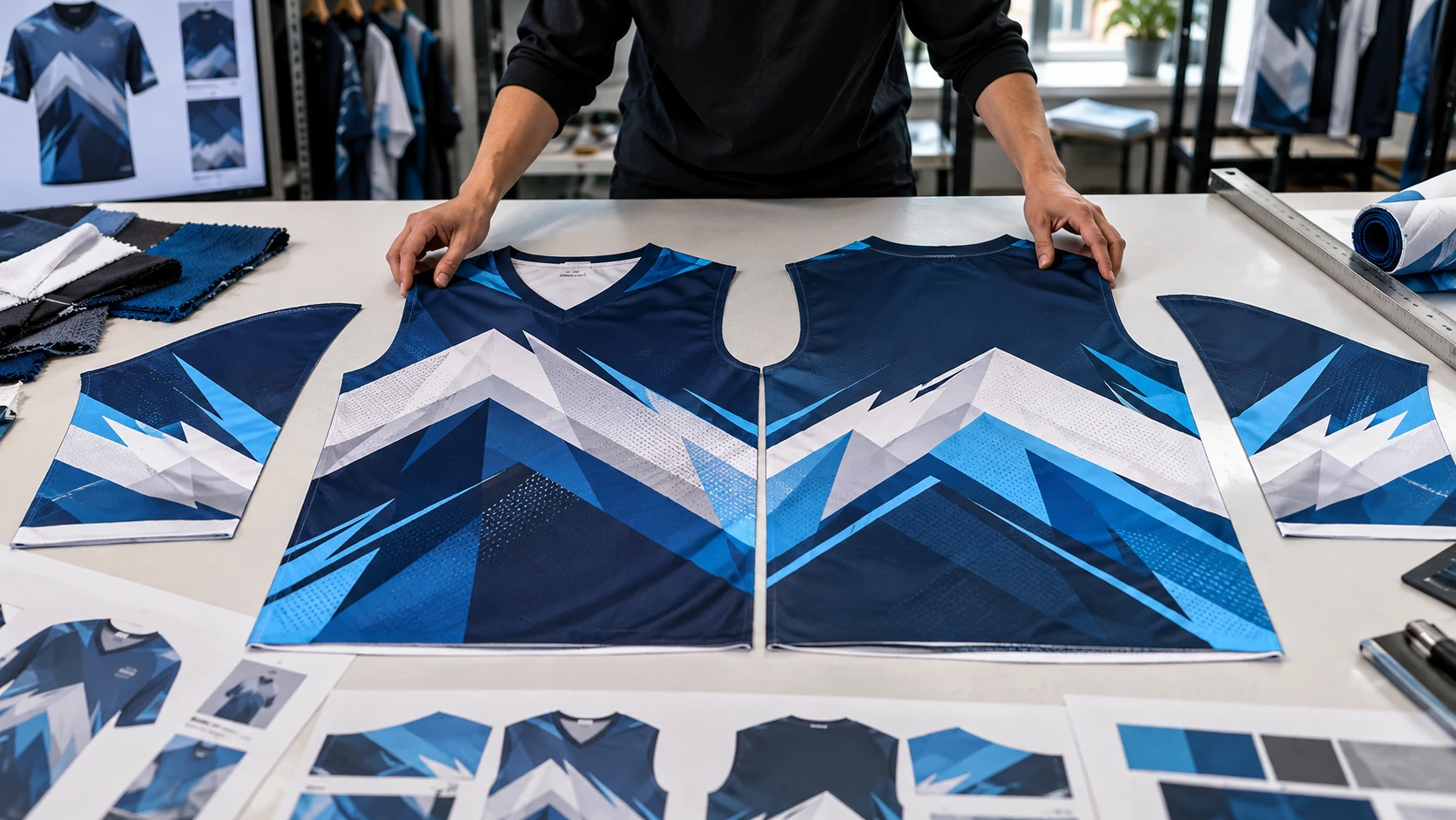
A batik-inspired pattern can look balanced as a flat rectangle and become crowded once it is divided across a shirt. Front, back, sleeve and collar pieces each have their own shape and seam allowance, so the production template should guide placement from the beginning. Decide which areas carry the strongest motif and which areas provide visual rest. A dense pattern across every panel can make a corporate shirt harder to pair with trousers, jackets or company branding. For corporate use, restraint is often a design tool rather than a limitation. Keep logos and identity elements in clear zones instead of forcing them to compete with the motif.
Choose a Repeat Scale That Works Across Sizes
Pattern scale changes the character of the shirt. A very small repeat can feel busy from a distance, while an oversized motif may be cropped unpredictably on smaller sizes. Test the repeat on at least one small, one medium and one large graded panel. If a focal flower, leaf or geometric form must remain visible, do not place it where seam allowance can remove half of it. Repeats that tolerate partial cropping are easier to grade than motifs that require exact centring. For mixed-size corporate orders, define whether the pattern scale stays physically constant or changes with the garment. That decision should be made before final colour approval.
| Design Decision | Risk if Ignored | Practical Control |
|---|---|---|
| Repeat scale | Pattern feels too busy or crops badly | Test small, medium and large panels |
| Seam transition | Motifs appear misaligned | Use forgiving breaks or organic repeats |
| Logo zone | Brand mark competes with pattern | Reserve a quieter panel area |
| Colour palette | Shirt becomes visually overloaded | Limit dominant and supporting colours |
Treat Seams as Deliberate Breaks
Traditional batik and sublimation are different production processes; a sublimated batik-style shirt is printed as garment panels and then sewn. That means a motif crossing a side seam or sleeve join may shift by a few millimetres during assembly. Instead of pretending the seam is invisible, design transitions that tolerate movement. Soft gradients, scattered organic motifs and interrupted borders are generally more forgiving than one thin geometric line that must meet perfectly. Critical logos and text should remain on a single panel. If a small sewing shift would make the pattern look wrong, redesign that seam area before production.
Control Colour as a Corporate Palette
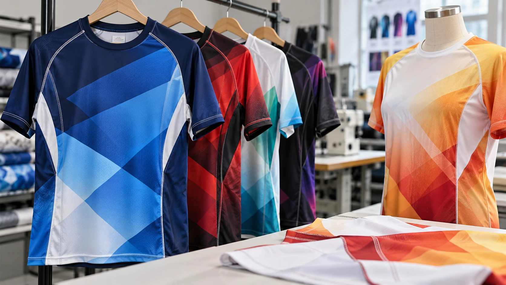
Sublimation can reproduce many colours, but corporate apparel rarely benefits from using all of them at once. Start with a controlled palette tied to the organisation's identity, then use one or two supporting tones for depth. Dark backgrounds can create a formal appearance, while lighter grounds can feel more relaxed, but the final choice also affects how logos and name embroidery or other additions read. Review colour on the intended polyester fabric rather than relying only on a phone screen. Fabric texture and heat transfer can change the perceived result. Keep an approved physical sample or colour reference for repeat orders.
Approve the Garment, Not Just the Pattern Tile
A repeating tile proves that the motif repeats; it does not prove that the shirt works. Review a full front, back and sleeve layout, then inspect a sewn sample when the design depends on panel relationships. Check the collar, shoulder, side seams and sleeve joins, and view the shirt from normal conversational distance. Ask whether the wearer still looks like part of a corporate team rather than a walking pattern sample. For Sarawak organisations using batik-inspired apparel for functions, customer-facing roles or corporate occasions, that balance between identity and wearability matters. Save the final graded panel files with the approved fabric and colour reference so reorders stay consistent.
Batik-inspired sublimation works best when the motif is designed around the shirt panels, not pasted onto them after the pattern is finished.
Frequently Asked Questions
Is batik sublimation the same as traditional batik?+
No. Traditional batik uses wax-resist and dyeing techniques; batik-inspired sublimation digitally transfers a batik-style design into suitable polyester fabric.
Can the motif line up perfectly at every seam?+
Production can be controlled, but sewn garments have tolerances. Design seam areas so small shifts are not visually damaging.
Can a corporate logo sit on top of a batik pattern?+
Yes, but it is usually clearer when the logo sits in a quieter area with sufficient contrast.
Need Production Support?
If this issue affects an upcoming apparel or printing order, JCP can help review the material, artwork and production requirements before bulk production.
Discuss Your Requirements