
Sublimation Jersey Names and Numbers: Readability, Contrast and Placement
The graphic on a team jersey can be approved and still cause trouble when player names and numbers are added at the last minute. One athlete has a short name, another needs a longer surname, and a small youth shirt offers less room than the adult sample. A brightly patterned back panel may also make the lettering hard to recognise during play. Personalisation is not simply typing names onto the same template: it needs type rules, visibility tests and a clean final roster.
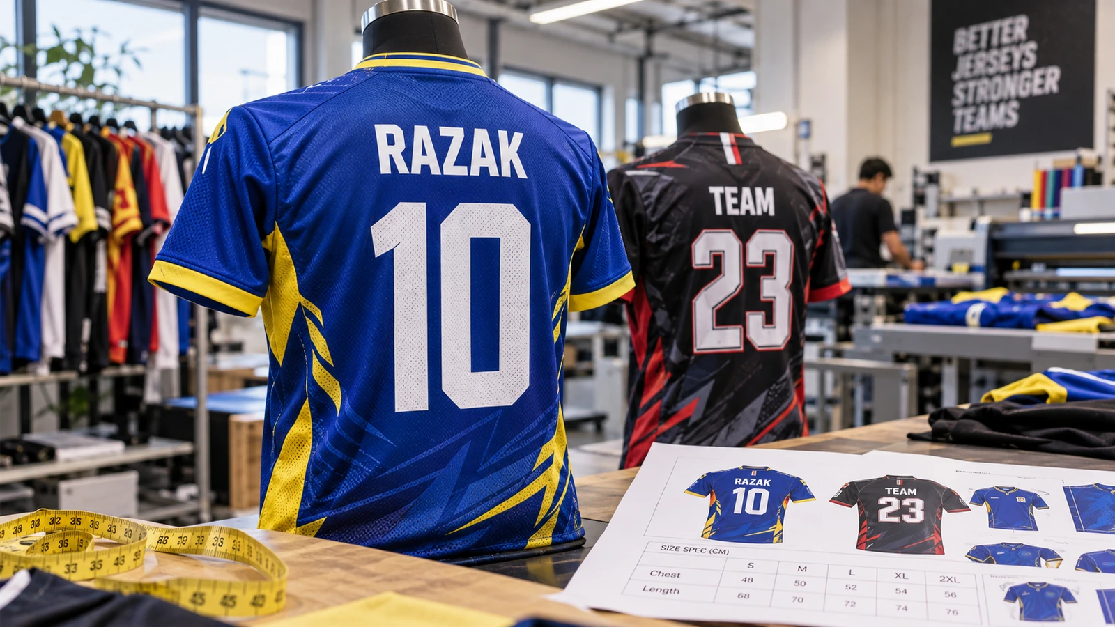
Prioritise legibility during actual play
Jersey names and numbers are normally read at a distance, while the player is moving. Thin decorative fonts, closely spaced numbers and low-contrast colour combinations can fail even when they look impressive on a monitor. Start by identifying the main purpose: spectator recognition, match officials, team identity or commemorative wear. A training shirt may allow more expressive typography; a competitive match jersey usually benefits from a simpler, bolder system.
Print a paper version at approximate final size and view it from several metres away. Better still, place a sample on a shirt and photograph it in the field environment. Bright sunlight, shadows and motion can change readability. A white number against a pale blue gradient may disappear at distance; an outline or darker backing area can help when used consistently. Do not rely only on close-up screen previews.
Create one typography rule for the whole roster
Select a typeface with recognisable digits, clear differences between similar characters and enough stroke weight for fabric printing. Check whether one, seven and four remain distinguishable, and whether zero could be mistaken for the letter O. Define the number height, name height, alignment and relationship between the two. Separate rules for adult and youth sizes can preserve readability without making a small jersey feel overcrowded.
Test the longest and shortest expected names before publishing the design. Avoid squeezing a long name horizontally until it becomes thin and uncomfortable to read. Options include a smaller but still practical font size, wider name area or carefully adjusted spacing. If player nicknames are allowed, confirm their spelling and whether they comply with the team's rules. Use a spreadsheet with a locked, final version rather than copying names from separate chat messages.
Choose a back-panel zone that supports the lettering
Full sublimation artwork may include diagonal stripes, flames, gradients and motifs across the back. Names and numbers need a calm enough area to stay prominent. Where possible, reserve a slightly simplified panel or place the lettering over a controlled colour field. A dark-to-light gradient crossing the digits can make parts of a number vanish. If a pattern must run behind the type, test whether an outline or a subtle separation field improves clarity without making the shirt look cluttered.
The position also needs to respect seams, collars and size grading. A number placed attractively on a large adult mockup might end up too close to the hem on a youth shirt. Check each product size against its actual printing template, not merely a scaled screenshot. If back-panel dimensions change across cuts, establish a consistent visual relationship rather than insisting on the same pixel distance for every size.
Plan names and numbers alongside the jersey construction
With panel-printed cut-and-sew production, important lettering should stay clear of seam allowances and shape transitions. A digit split by a side seam or folded into a curved garment panel may no longer read cleanly. For ready-made jerseys decorated after manufacture, the available area is constrained by seams, fabric texture and method suitability. Confirm which production route is actually being used before locking the composition.
Ask the production team for front and back templates that correspond to the chosen style. Keep critical text away from high-stretch points where distortion may be obvious when the shirt is worn. Inspect a sewn sample on a person or mannequin, not just a flat panel. Some designs look balanced on the cutting table but shift visually across the shoulders or lower back when assembled.
Proof every player record and variant
Create a roster with one line per player: confirmed name, spelling, number, garment size, garment cut and any special instruction. Use consistent capitalisation and check repeated numbers where the team’s competition requires uniqueness. Avoid making changes to the artwork through informal voice notes after sign-off. A single typo can force a complete replacement garment and may be hard to detect until all shirts are distributed.
Send each named variant through a structured proof or at least an automated visual sheet that allows the coordinator to review the entire list. Confirm how a name such as O'Connor or a two-part family name should appear. Record the final approval date and version. Keep the original roster separate from later changes so production can identify what has already been completed and what still needs correction.
Use a sample to check contrast and handover
A print sample should show the most difficult combination: the longest name, the highest-digit count, a small shirt and the busiest background. Assess it under daylight and indoor lighting, then test its fit. Check the colour relationship between the lettering and its surround, the relative balance of name and number, and whether the final sewn panel preserves the intended spacing. A robust design will remain legible across the size range.
JCP publishes a dedicated sublimation service and cut-and-sew uniform information. When requesting a quotation, state the number of personalised variants, size distribution, artwork status and whether each player name is unique. Do not assume personalisation has the same production cost or process as one shared design. Supply a clean approved roster with artwork files and keep a completed sample for later team reorders.
Frequently asked questions
Should every jersey use exactly the same number size?
Use a consistent visual system but confirm scale on the actual garment sizes. Youth and adult cuts may require different dimensions to avoid crowding.
Can names cross a sublimation seam?
They can be technically printed across panels in some processes, but this creates alignment and readability risks. Keep critical lettering in a stable panel area where possible.
How can a busy back pattern be made readable?
Reserve calmer space or add contrast treatment behind the lettering, then test the result at viewing distance on printed fabric.
What should be finalised first: roster or design?
Establish the typography rules using sample names, then lock the accurate roster before mass personalisation begins.
Before you approve the order
The most reliable personalised jersey order has two signed approvals: the shared design system and the individual player data. Keep a proof of the smallest size and the longest name, plus a production roster that cannot be casually edited. Those steps protect readability and reduce expensive replacements much more than adding a last-minute outline to every number.