
Embroidery Thread Colours: Why a Screen Match Is Not a Sewn Match
A logo colour can be precisely defined in a brand guide and still look different when it becomes embroidery. Thread reflects light, garment colour changes contrast, and physical thread ranges are discrete, so approval should be based on a sewn sample rather than a screen alone.
In This Article
Direct Answer
Use the brand colour as the target, then choose the closest physical thread from the producer’s available range and approve it on the actual garment. A screen value is a reference; the sewn result is the production proof.
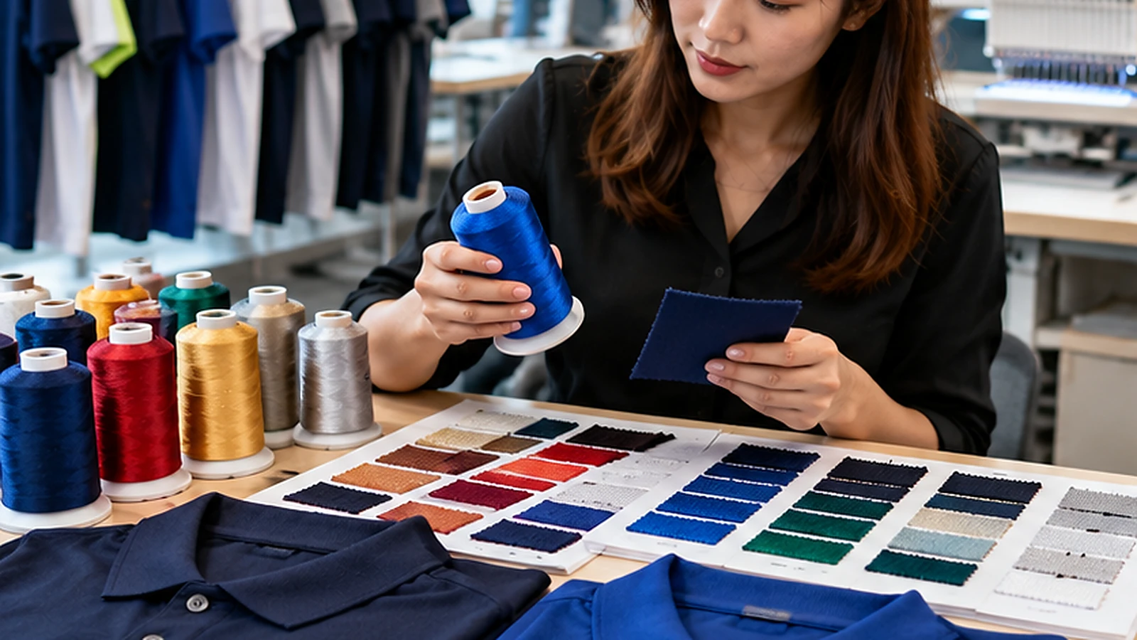
Screens and Thread Produce Colour in Different Ways
A monitor emits light, while embroidery thread reflects it. That difference alone can make the same intended blue appear brighter on screen and deeper in thread. Thread also has sheen and directional texture, so the colour can shift slightly as the viewing angle or lighting changes.
This is why a digital mock-up is useful for placement but weak as the final colour approval. A brand’s RGB or HEX value can communicate intent, while a Pantone reference may narrow the target, but the producer still has to choose from real thread colours that exist in stock.
The Garment Colour Changes Perceived Contrast
The same royal-blue thread can look vivid on a white polo and subdued on navy. Light thread on dark fabric may appear stronger because the contrast is high, while a subtle tone-on-tone logo may need a deliberate step lighter or darker so the mark remains visible at normal distance.
Approve colour in context. If the order includes black, navy and white garments, do not assume one thread choice gives the same visual result on all three. A brand may decide to keep one consistent thread for production simplicity or use approved light/dark variants to preserve readability.
| Approval Reference | What It Tells You | What It Cannot Guarantee |
|---|---|---|
| HEX / RGB | Digital brand intent | Physical thread appearance |
| Pantone reference | Colour target | Exact thread availability |
| Thread chart | Available physical shades | Appearance on the garment |
| Sewn sample | Real production result | Future batch without recording codes |
Sheen and Stitch Direction Affect the Visual Result
Embroidery is not a flat patch of colour. Satin stitches, fill stitches and different stitch directions catch light differently. A compact satin border can appear brighter than a broad fill area even when both use the same thread cone. Metallic or highly lustrous threads exaggerate this effect further.
When colour accuracy matters, view the sample from the distance where the logo will normally be seen. Close inspection is useful for stitch quality, but brand recognition happens on the worn garment, often under office, retail or daylight conditions.
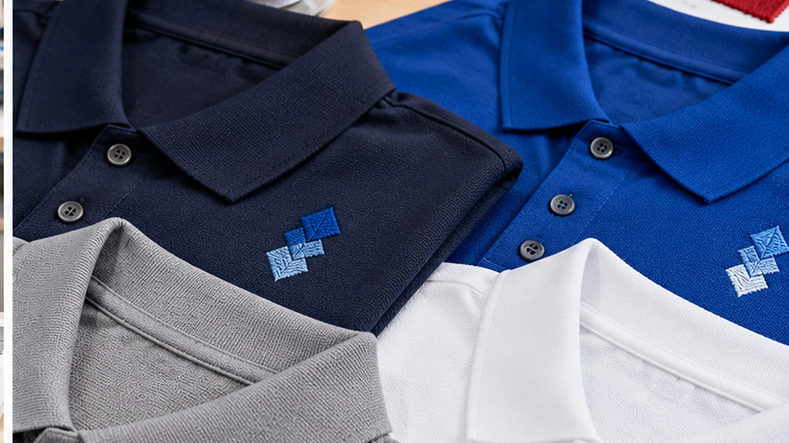
Build a Small Sew-Out Into the Approval Process
Ask for a stitched sample using the chosen garment colour, final logo size and proposed thread colours. Compare it with the brand reference under neutral light, then check it again in the environment where staff will work. The goal is not to chase an impossible exact screen match; it is to reach an approved physical appearance.
If the logo contains several similar blues or greys, confirm that the available thread shades are far enough apart to remain distinguishable after stitching. Two colours that look separate in a design file can merge visually when reduced to a small chest mark.
Record the Thread Choice for Repeat Orders
Once approved, keep the thread brand or colour code with the embroidery file and garment specification. Do not write only ‘blue’ or ‘gold’. A future reorder is much easier when production knows the exact approved thread rather than selecting a new nearest match.
Keep one physical embroidered reference as well. That sample captures the interaction between thread, fabric and stitch density in a way a spreadsheet cannot. It becomes a practical standard when the logo is reproduced months later.
Approve embroidery colour in thread, on the garment, under real light—not only on a monitor.
Frequently Asked Questions
Can embroidery thread match a Pantone colour exactly?+
Sometimes a very close shade exists, but thread ranges are discrete and the final appearance also depends on sheen, fabric and lighting.
Should one thread colour be used on every garment colour?+
It can be, but check contrast on each garment. Some brands approve alternate light and dark thread versions.
What should be saved for repeat orders?+
Keep the approved thread code, embroidery file, garment model and a physical reference sample where possible.
Preparing an Embroidered Logo?
JCP can review logo size, garment colour and thread options before a sew-out is approved for production.