
Sublimation Colour Proofing: Screen RGB vs Printed Polyester
A vibrant jersey design may be approved on a computer screen and then look noticeably different when transferred to polyester. Blue shifts toward purple, a dark shadow loses detail or a bright red appears less intense than expected. These differences do not automatically mean the printer made a mistake. Screen display, textile substrate, transfer process and lighting each influence how colour is perceived. A useful colour-approval workflow therefore focuses on printed samples under agreed conditions rather than relying on screen appearance alone.
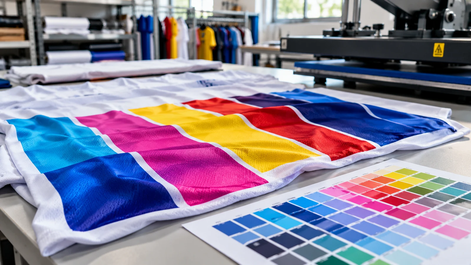
Understand why RGB screens and textiles differ
Digital screens emit light to display colour, commonly using red, green and blue channels. Printed fabric reflects the light that reaches it, and its appearance depends on dye or ink, fibre, texture and surrounding illumination. Some vivid screen colours cannot be reproduced with equal intensity through a given textile process. A file that appears fluorescent on a bright phone display can therefore be impossible to match exactly on a matte jersey surface.
Do not treat RGB, CMYK or a named colour number as a guarantee of a physical result. Colour profiles are useful tools for communicating and converting values, but their accuracy depends on a controlled workflow and calibrated equipment. If several people approve an artwork on different phones, their screens may show different tones. Establish who is authorised to approve the final colour and what physical sample or reference will be used for comparison.
Begin with the actual fabric and intended technique
Dye sublimation works by transferring suitable dyes to compatible synthetic fibres, commonly polyester. A different base fabric or finish can change the final appearance even if the source artwork remains identical. White or light substrates are typically used for full-colour sublimation, because transparent dye does not behave like an opaque white ink. Printing a pale colour on a dark substrate without the correct method can lead to weak or unpredictable results.
Ask the production team for the actual jersey fabric and print method before final colour approval. Two white fabrics with different weave and finish may not reflect colour identically. Highly textured performance knits can create subtle visual variation across solid areas. JCP lists sublimation for polyester sportswear among its verified apparel services, but that general capability does not substitute for testing the chosen substrate and specific production setup.
Build a physical colour strip for important shades
Choose a small set of brand-critical colours rather than trying to evaluate every pixel in a complicated design. Include the main base, a dark shade, a highlight, a skin-sensitive colour if applicable and any sponsor colour that has to remain recognisable. Print test patches on the actual fabric using the intended process, then label each swatch with its digital artwork reference. Keep a copy of the production settings or file version used for that trial.
A colour strip should also test gradients and fine lines if they are central to the design. Some transitions that look smooth on a screen can appear banded or less distinct on textile; small pale details may fade into the base colour. Hold samples against one another and choose the best visual compromise for the whole garment. Approving a single isolated bright blue does not guarantee that the complete jersey design will have the intended depth or contrast.
View samples under agreed lighting
Colour temperature matters. A red patch may look different under cool LED office light, warm indoor lamps and daylight. For outdoor sportswear, daylight viewing may be especially relevant, but stakeholders should agree on the primary inspection condition. Compare samples side by side on a neutral background and avoid allowing coloured walls or phone flashes to dominate the assessment. Consistency of lighting is more useful than arguing about a photograph taken in unknown conditions.
Printed samples should also be inspected when the garment is worn or draped, not only as a flat square. Stretch and surface direction can alter perceived tone and reveal the fabric’s white base in some constructions. Check dark printed areas near seams, shoulder curves and under bright light. If a sponsor mark has strict brand rules, request the colour reference and ask the supplier what level of matching can realistically be achieved with the chosen system.
Protect colour consistency through the production run
A colour-approved sample is useful only if the final process matches it closely. Record fabric model, artwork version, substrate colour and the agreed reference swatch. If a different batch of fabric or transfer consumable is introduced, ask whether a new check is required. Do not assume a proof made months earlier on another garment can serve as unquestioned approval. Small process variations are possible, so inspection should consider a practical tolerance rather than an imaginary promise of absolute identity.
Think about the full team rather than one impressive hero sample. A jersey may contain large solid colour fields that reveal differences between pieces more clearly than a busy all-over pattern. If several panels are cut and sewn, ensure their colours appear consistent when assembled. A print that looks correct on each separate section can still appear uneven when different fabric orientations meet. Keep the approved reference on hand during quality review and note any accepted variation.
Prepare a colour-approval file that prevents disputes
A useful handoff includes the original artwork, embedded or stated colour profile if relevant, named critical colours, selected fabric, print method and photographs of the approved physical sample for identification. The photographs are supplementary records, not an exact colour standard. Label artwork revisions clearly, and obtain a single written approval after the decision-maker has inspected the test. If the design changes afterward, identify which colours or panels need fresh proofing.
For reorders, preserve a clean sample away from prolonged sunlight and harsh washing so it remains meaningful as a reference. Compare future garments in the same viewing conditions and confirm whether the original fabric is still available. The practical objective is repeatable, recognisable team colour, not perfect numerical equality between a glowing display and a woven textile. When buyers understand that distinction, they can make informed approvals and avoid preventable disagreement at delivery.
Frequently asked questions
Can sublimation reproduce every RGB colour exactly?
No. Display and print gamuts differ, and the polyester substrate influences appearance. Use a physical print proof for colours that matter.
Does choosing a CMYK file guarantee accurate jersey colour?
No. A conversion can help a managed workflow, but output still depends on printer, inks, transfer process, fabric and viewing light.
Why does the same printed colour look different indoors and outdoors?
Light sources have different spectral qualities, and the fabric reflects them differently. Agree on the lighting condition for official approval.
Can yesterday’s proof be reused for a new fabric model?
Treat it as a visual guide only until the new substrate is checked. A change in weave, finish or fibre blend can alter the result.
Preparing an order? For garment, artwork and print specifications, consult JCP’s official printing-service information and request a quotation for the exact item and quantity.