
One Logo Across Shirts, Caps and Gifts: Keeping Brand Details Consistent
Make a single visual identity work across embroidery, apparel prints, caps and promotional merchandise.
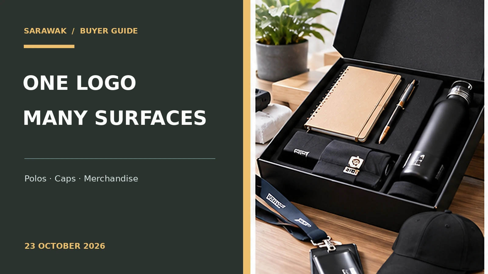
A company may use the same logo on polo shirts, caps, bottles and printed stationery, yet the result can look inconsistent if every supplier improvises the artwork. Embroidery has thread and stitch limits; a bottle label has different dimensions; a T-shirt back can support much larger details. Consistency means preserving recognition while adapting the artwork intelligently to each surface.
Whether the order is for a small business or a larger team, the most reliable buying decisions start with what people will actually use. A physical proof, a realistic handling test and an agreed specification usually reveal more than an attractive online photograph. Treat appearance, function and future repeat orders as parts of the same decision.
Build a small, practical logo system
Start with a full logo, a simplified emblem and a one-colour version that all come from the same approved master. The tiny front of a cap is not the right place for a long company slogan. A simplified version can preserve brand recognition without forcing unreadable letters. Specify when each version should be used, rather than making designers guess.
Save vector originals, approved colours and a minimum clear-space rule. Even a one-page brand sheet can prevent a supplier from stretching the logo or substituting a different typeface. Choose the version that suits each item, not the one that fills the most area.
Adapt artwork to embroidery
Embroidery recreates designs as stitches rather than ink. Very small text, subtle gradients and thin negative spaces can close up on a compact embroidered cap or chest mark. Ask for digitising and a sample on the actual fabric. Stitch density and backing need to suit the garment so the finished logo does not pucker.
The same original logo may need a simplified stitch file without becoming a different identity. Compare thread colours with physical references and approve the size in millimetres. A clean small emblem generally works better than forcing a complicated print design into embroidery.
Check printing on dark and light apparel
Printing methods vary in how they handle gradients, white underbases and garment textures. A mark that looks sharp on a white T-shirt may need extra preparation on black fabric. If the order spans polyester jerseys and cotton shirts, one method may not suit both. Compare production proofs rather than using a single generic screen mockup.
The JCP printing-services overview describes options across apparel and paper printing. Use those services to discuss method selection, but preserve one approved visual identity across the separate production methods. Include a dark-background and light-background artwork variant where necessary.
Use a different hierarchy on merchandise
Bottles, notebooks, tote bags and caps have different usable areas and viewing distances. A back-of-shirt slogan can be several words; a bottle mark may need to be an emblem only. Keep the brand’s essential shapes and proportions intact while trimming secondary information that would become illegible.
Ask for placement diagrams showing the product orientation and safe printable area. On a bottle, note whether the logo faces the user when held in the typical way. On a tote, avoid printing so low that artwork disappears in fabric folds.
Control colours across substrates
Thread, dyed fabric, paper ink and transfer prints reflect light differently. Even with identical digital colour codes, the perceived shade may vary. Choose an acceptable visual tolerance and prioritise faithful overall appearance rather than demanding impossible exact matches. Printed samples help reveal problems that screen previews hide.
Check brand colours under daylight and typical indoor light. A colour chart on coated paper cannot guarantee a match on rough cotton or translucent plastic. Note which physical reference has final approval for each substrate and keep that record with future orders.
Create a repeat-order quality checklist
When multiple items are ordered at different times, errors arise from versions rather than intentions. Put the approved logo file, placement dimensions, colour references, supplier sample photos and revision date into one folder. Ask a single internal owner to sign off proofs. A consistent review process is often more effective than asking every supplier to “make it look premium.”
Before approving production, check shape distortion, spacing, font, colours, location, fabric effects and packaging. Photograph the approved sample with neutral lighting. Those records let future staff reorder without reinventing the identity or accidentally mixing old and new artwork.
Four details to confirm before ordering
| Item to check | Why it matters |
|---|---|
| Master logo variants | Agree on the final specification and check a physical sample where practical. |
| Embroidery proof | Agree on the final specification and check a physical sample where practical. |
| Print colour references | Agree on the final specification and check a physical sample where practical. |
| Placement by item | Agree on the final specification and check a physical sample where practical. |
For a quotation, prepare the intended quantity, preferred size or format, available artwork, colour direction and expected date of use. Ask the supplier to identify which decisions are fixed and which are still assumptions. Where a sample is needed, plan enough time to review it before final approval instead of compressing all checks into the final production week.
Frequently asked questions
Should every product use exactly the same logo size?
No. Scale and placement should suit each product while preserving proportions.
Can one artwork file work for print and embroidery?
The master can be shared, but embroidery usually requires its own digitised stitch file.
Can colours look identical across fabric and paper?
Often not perfectly. Approve practical tolerances using physical samples.
Make the next order easier
If you are building a purchasing shortlist, compare the relevant printing and customisation services with the practical checks above, then seek a quotation using the actual artwork and quantities. The goal is to obtain a repeatable result that works after the first week, not merely an attractive sample on delivery. For more uniform buying advice, you can also browse UniformSarawak.com.