
Sizing Banners and Backdrops From Viewing Distance, Not Guesswork
A banner can be physically large and still communicate poorly. The useful size depends on where people first see it, how long they have to look, what else competes for attention and whether the display must work in photographs.
In This Article
Direct Answer
Start with the viewing zone and message hierarchy. Decide what must be understood from far away, what can wait until a visitor approaches, and how much physical width the display must occupy. Only then choose the banner or backdrop dimensions.
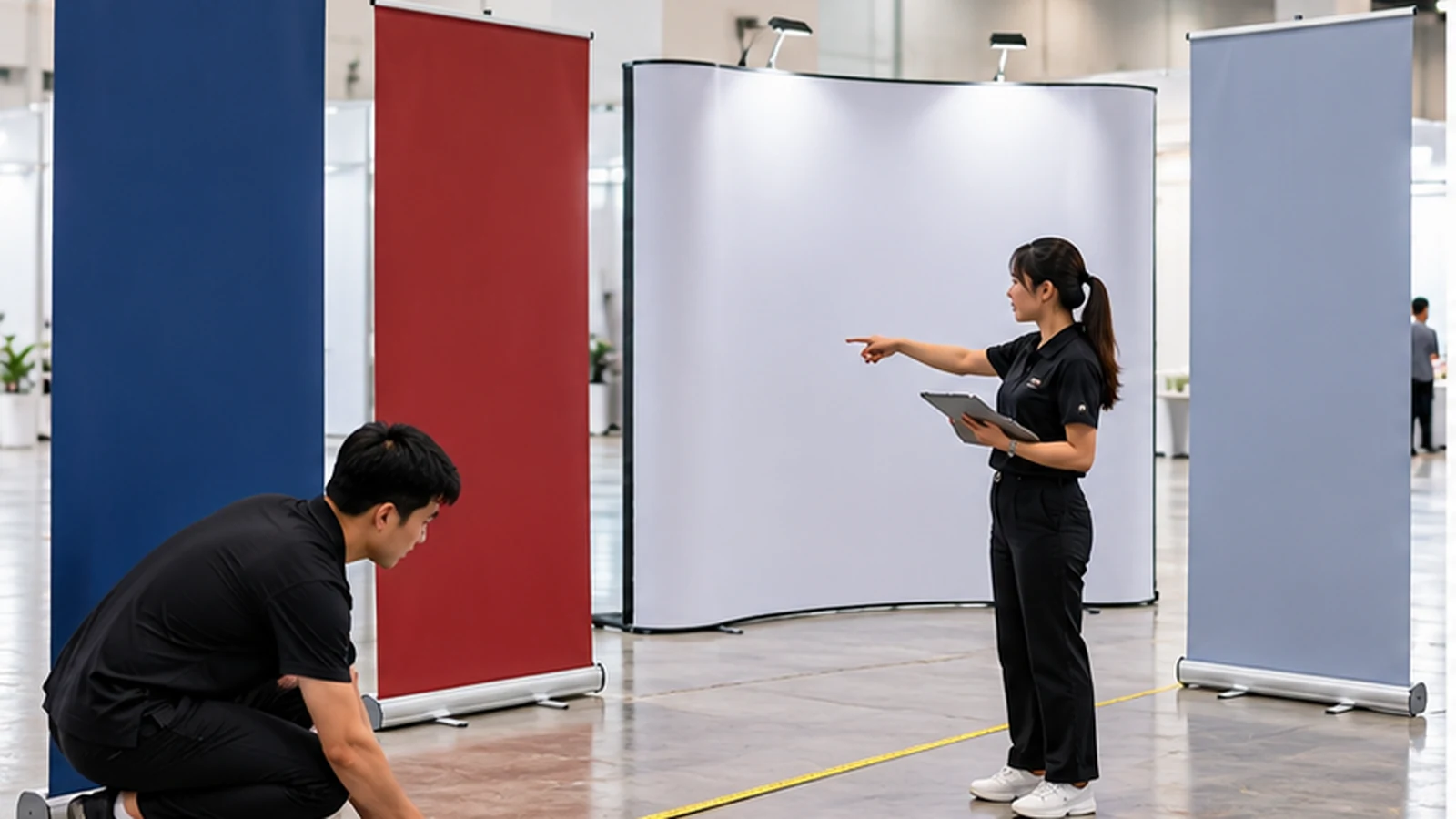
Draw three viewing zones before opening the artwork
Think of a display as three distances. The far zone is where a visitor first notices colour, brand shape and one short message. The middle zone is where a person decides whether to approach. The near zone is where supporting details, QR codes or product information can be read. Trying to make every piece of information work at the far zone usually produces oversized text and a clumsy layout; making everything near-zone size produces a wall of information that disappears from a distance.
Mark these zones on the floor plan. If an aisle gives people a clear 8–10 metre sightline, the display needs a strong far-zone element. If the booth faces a narrow corridor, the priority may shift to side visibility and faster recognition at 3–5 metres. This exercise changes design decisions before money is committed to a large-format print.
Size the display to the physical architecture
Backdrop width should relate to the booth, stage or wall it occupies. A three-metre graphic squeezed behind furniture can lose important content at the edges, while a narrow roll-up banner may look isolated on a wide empty wall. Measure usable width after accounting for counters, access routes, power points and structural frames. Do not assume the nominal booth size equals printable visual space.
Also consider how people stand in front of the graphic. At an event, staff and visitors may block the lower third of a backdrop for most of the day. Put critical information above typical shoulder height rather than centring it mathematically on the canvas. For photo backdrops, repeatable background motifs can work better than one central mark that is hidden by every group photo.
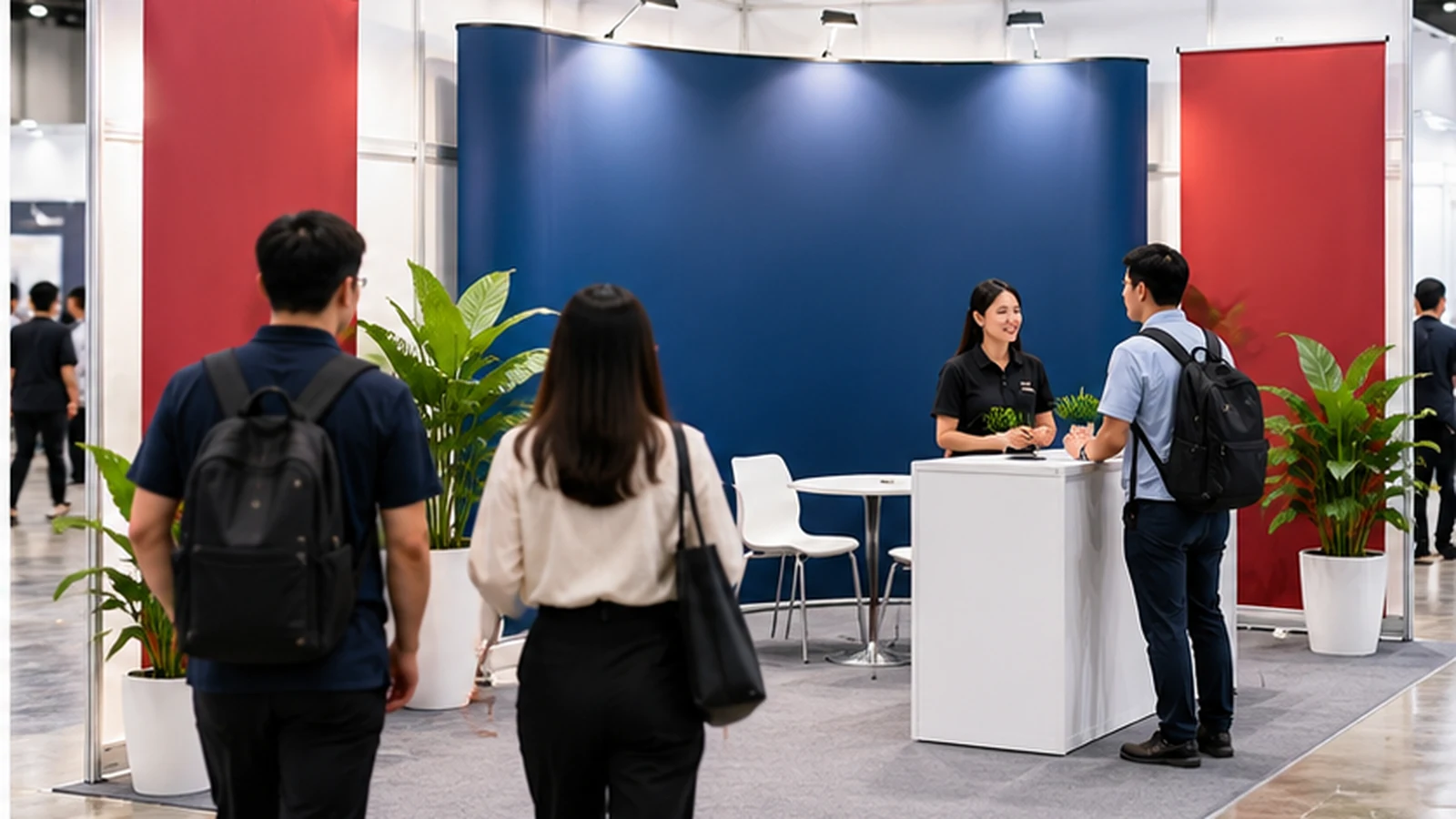
Use a hierarchy budget instead of filling empty space
Give the design a limited number of jobs. A practical booth graphic might need one brand identifier, one proposition and one directional action. Product lists, full company histories and dense contact blocks usually belong on a brochure, screen or handout. Large-format print rewards editing because each additional message competes with the one before it.
One useful test is the three-second read. Stand at the intended middle distance and look for three seconds. If you cannot say what the display is about and where to go next, the hierarchy is weak. This test is more meaningful than judging the artwork zoomed out on a laptop, because a screen does not reproduce the surrounding hall, people or visual noise.
| Zone | Visitor behaviour | Best content | Common mistake |
|---|---|---|---|
| Far | Notices the booth/display | Colour, identity, one short message | Small text or multiple claims |
| Middle | Decides whether to approach | Main offer or category cue | Too many equal headlines |
| Near | Stops and engages | Details, QR, supporting points | Placing all information here without a far cue |
| Photo zone | People stand in front | Repeatable or elevated brand elements | Important content hidden behind people |
Plan resolution and safe areas at final size
Large-format artwork should be prepared with final output size in mind. Photographs that look sharp in a social-media post may not hold up when enlarged across a backdrop. At the same time, giant files with unnecessary resolution can slow production without improving what a visitor sees from several metres away. Ask the printer for the preferred artwork scale, bleed and effective resolution for the specific output method.
Keep critical text and marks away from trim lines, eyelets, pole pockets and hardware. Curved displays and tension systems can also wrap artwork away from the frontal viewing area. A safe-area guide should be part of the template before design begins. Production finishing is not an afterthought; it changes which parts of the printed surface are actually visible.
Choose display dimensions from the space and sightline first; the artwork should solve a physical communication problem, not simply fill a standard print size.
Frequently Asked Questions
Is a bigger backdrop always easier to read?+
No. Readability depends on hierarchy, viewing distance, contrast and how much content competes for attention.
Where should a QR code go?+
In a near-viewing area where a visitor can stop and scan without blocking traffic.
Why keep important content away from edges?+
Finishing hardware, trim, curves and framing can reduce the visible area.
Planning banners, posters or a backdrop?
JCP can produce large-format display materials and help translate confirmed dimensions into practical print artwork specifications.
Discuss Display Printing