
Embroidery Lettering: When Small Text Becomes Too Fine to Sew Cleanly
Small lettering can look sharp on a screen and still lose clarity once it becomes thread. The practical limit is not a single font size: letter shape, stroke width, fabric texture, thread, backing and stitch density all affect whether the finished name or tagline remains readable.
In This Article
Direct Answer
Treat small embroidery text as a production test, not a typography exercise. Simple block letters with open counters and thicker strokes survive reduction better than thin, condensed or highly decorative fonts. If a tagline matters, sew a sample at actual size before approving the bulk order.

Thread Has Physical Width
Embroidery is built from stitches rather than pixels. When two narrow strokes sit too close together, thread can visually merge them; when an internal opening is tiny, stitches can close it. Fabric also moves under the needle, so the same digitised file may look slightly different on a smooth woven shirt and a textured pique polo.
This is why shrinking an existing chest logo is risky. The artwork may scale mathematically, but the stitch plan does not become infinitely fine. A good digitiser may need to simplify tiny details, change stitch direction or remove a line that cannot be reproduced reliably.
Judge Letter Shapes, Not Just Font Size
Font size alone is a poor production specification because two fonts at the same point size can have very different stroke widths and openings. Lowercase letters such as e, a and s often expose problems first, while narrow characters can disappear into neighbouring stitches.
For employee names, prioritise legibility over matching a decorative brand typeface exactly. For a corporate logo, keep the approved brand artwork as the reference, then agree which small elements may be simplified for embroidery rather than letting production make ad-hoc changes.
| Risk Factor | Lower Risk | Higher Risk |
|---|---|---|
| Letterform | Open block lettering | Thin, condensed or script lettering |
| Surface | Smooth stable fabric | Deep texture or stretch |
| Detail | Few clear elements | Tiny outlines and micro-text |
| Approval | Actual garment sew-out | Screen proof only |
Fabric Texture Changes the Result
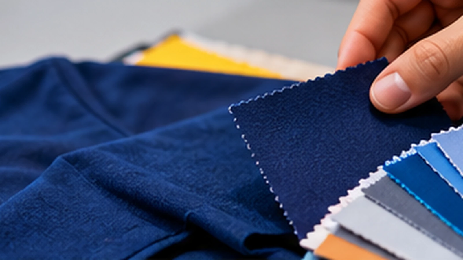
Pique, fleece and other textured surfaces can swallow fine stitches more readily than a smooth, stable woven fabric. Proper backing and, where appropriate, topping help stabilise the embroidery area, but they cannot rescue detail that is fundamentally too small.
A useful approval sample should therefore use the actual garment style and colour, not only a scrap of convenient fabric. Dark thread on dark fabric, reflective thread and very soft garments can also change perceived sharpness.
Build an Actual-Size Sew-Out Into Approval
Ask for the embroidery to be tested at the intended finished width. View it from normal wearing distance as well as close up. Check whether every letter is distinguishable, whether small counters remain open and whether the garment puckers around the design.
If the sample fails, change one variable at a time: enlarge the mark, simplify the small text, increase spacing or move secondary wording to another application method. That is more controlled than repeatedly increasing stitch density.
A Simple Decision Rule
If the smallest wording is essential to identification or compliance, it must remain readable in the physical sample. If it is only decorative and becomes muddy at chest-logo scale, removing it can produce a more professional result than forcing it into thread.
The best embroidered logo is not the file with the most retained detail. It is the version that preserves the brand clearly on the garment people will actually wear.
If a word matters, approve the stitched word—not merely the vector artwork.
Frequently Asked Questions
Can embroidery reproduce every detail in a vector logo?+
No. Vector artwork can contain details that are physically too small for thread at the chosen finished size.
Should I simply increase stitch density for tiny text?+
Not automatically. Excess density can create stiffness, distortion and thread build-up.
Is a larger logo always the answer?+
Not always. Simplifying secondary details or changing the lettering can preserve a more balanced chest mark.
Preparing a Logo for Uniform Embroidery?
JCP can review the garment, placement and artwork before an embroidery sew-out is approved for production.
Discuss Your Embroidery