
Silkscreen Underbase on Dark Shirts: When It Matters and What It Changes
Printing a bright colour onto a dark shirt often needs an underbase: a controlled light layer printed beneath the visible colour. It improves opacity, but it also changes print feel, registration demands and production time, so it should be planned rather than added automatically.
In This Article
Direct Answer
Printing a bright colour onto a dark shirt often needs an underbase: a controlled light layer printed beneath the visible colour. It improves opacity, but it also changes print feel, registration demands and production time, so it should be planned rather than added automatically.
The Shirt Colour Is Part of the Print System
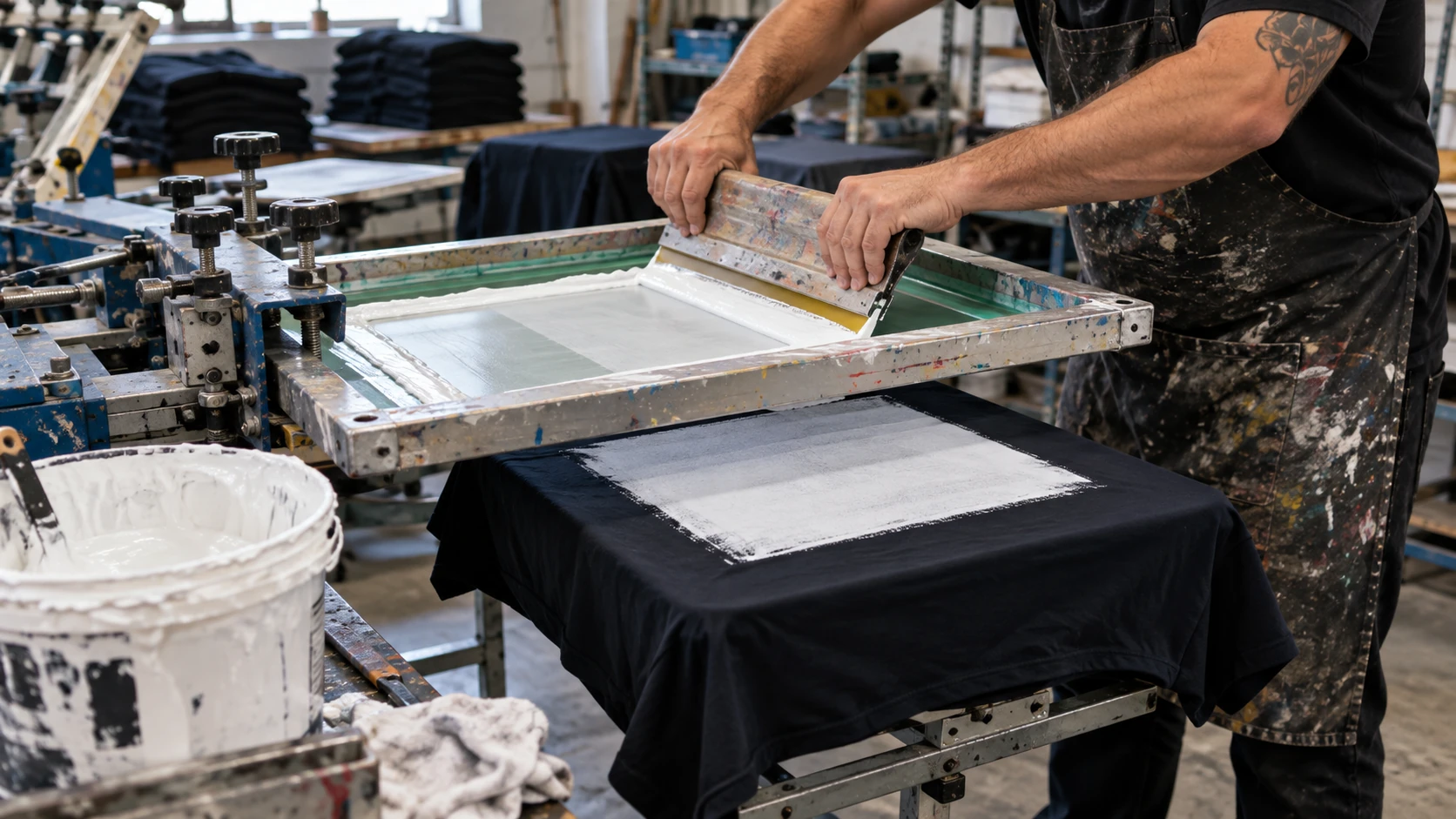
Screen-printing ink does not exist in isolation from the garment underneath it. A yellow or red ink that looks bright on white cotton can appear duller when printed directly onto black, navy or maroon because the dark fabric influences what the eye sees. An underbase creates a lighter foundation so the top colour can reproduce more predictably. That is especially useful for brand colours, safety graphics or artwork where strong contrast matters. However, not every design needs a full white base beneath every element. A distressed graphic or intentionally muted print may work better without one. Start with the intended visual result, then decide how much opacity the job actually needs.
An Underbase Adds Another Printed Layer
The underbase is not free opacity. It adds ink, another screen or production step, and another layer that has to align with the colours above it. If the base is too heavy, the print can feel unnecessarily thick; if it is too weak, the top colour may still look dirty or inconsistent. Printers may use a flash cure between the base and top colours so the next ink does not mix into a wet layer. That changes cycle time and heat exposure. For a large corporate order, those details affect both quality and throughput. The useful question is therefore not simply 'Do we need white underneath?' but 'What base coverage gives the required colour with acceptable hand feel?'
| Situation | Underbase Tendency | Reason |
|---|---|---|
| Bright logo on black/navy shirt | Usually useful | Improves opacity and colour separation |
| Muted vintage-style graphic | May be reduced or omitted | Dark fabric can be part of the effect |
| Fine multi-colour logo | Useful but registration-sensitive | Base must sit cleanly beneath small elements |
| Polyester performance shirt | Needs material-specific testing | Heat and dye migration can affect the result |
Registration Becomes More Visible
A misregistered underbase can create a thin white halo around coloured artwork, especially on sharp text, borders and small logos. Good separation work often chokes the underbase slightly so it sits inside the edge of the top colour rather than extending beyond it. The amount has to be controlled: too much choke can leave dark fabric showing at the edge, while too little increases the risk of a visible halo. Fine artwork also becomes harder because every additional colour must register against the base. Before bulk production, inspect the sample from normal viewing distance and close range. A print can look acceptable on the press but reveal alignment issues once the shirt is worn and stretched.
Fabric and Ink Choice Still Matter
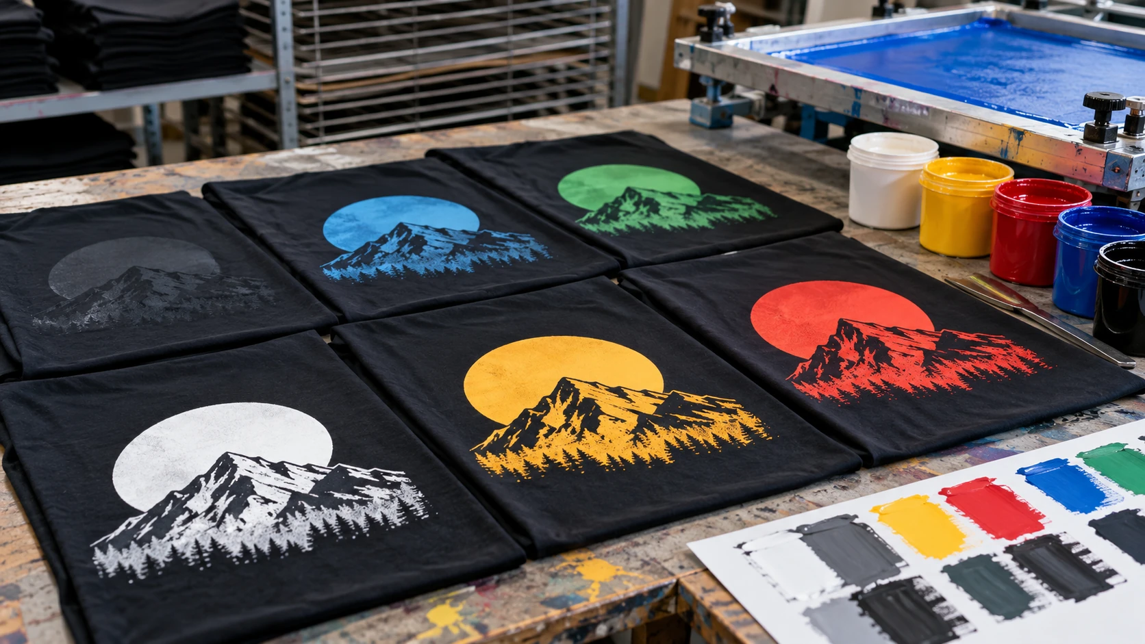
An underbase cannot solve every dark-shirt problem. Some polyester garments can release dye into the print when heated, causing colour migration that makes a white base look pink, grey or otherwise contaminated. Cotton, cotton blends and polyester performance shirts can therefore require different ink systems or curing choices. The surface texture matters too: coarse fabric can make a thin base look less even than a smooth jersey. If the order uses dry-fit or sublimated polyester, tell the printer exactly what garment is being used before artwork is separated. The same artwork on two dark shirts can need different production settings.
Approve Colour on the Actual Garment
Digital mock-ups are useful for placement, but they cannot show ink opacity, fabric texture or print feel accurately. For colour-sensitive work, approve a physical strike-off or production sample on the actual shirt colour and material. Check the top colour under normal indoor light and, if the uniform is used outdoors, daylight as well. Feel the print rather than judging only appearance. Also confirm whether the approved sample includes the same underbase and curing process intended for bulk production. That prevents a common mismatch where the artwork is approved digitally but the production result is judged by a standard the sample never demonstrated.
An underbase is a colour-control tool, not a default 'extra coat'. Use only the coverage needed for the approved result.
Frequently Asked Questions
Does every dark shirt need a white underbase?+
No. It depends on ink opacity, artwork, garment colour and the intended visual effect.
Why is there a white outline around my print?+
The underbase may be extending beyond the top colour because of registration or separation settings.
Can underbase make a print feel thicker?+
Yes. More ink layers can increase print feel, which is why base coverage should be controlled.
Need Production Support?
If this issue affects an upcoming apparel or printing order, JCP can help review the material, artwork and production requirements before bulk production.
Discuss Your Requirements