
Business Card Finishes: Matte, Glossy or Uncoated?
Business cards are small, but the finish says a lot before anyone reads the name or job title. The wrong finish can create glare, feel off-brand or even make the card inconvenient to write on. The right finish, by contrast, helps the card feel consistent with the company’s tone and practical use.
That is why the finish decision should not be reduced to “whichever looks premium”. Matte, glossy and uncoated each solve different problems, and the best one depends on how the card is distributed, how the brand wants to feel and whether the card needs handwritten notes.
In This Article
Direct Answer
Choose matte when you want a clean, versatile and contemporary finish that works for most corporate uses. Choose glossy when image vibrancy or shine is important and the card does not need to be written on. Choose uncoated when tactile feel, a natural paper look or note-taking matters more than surface shine.
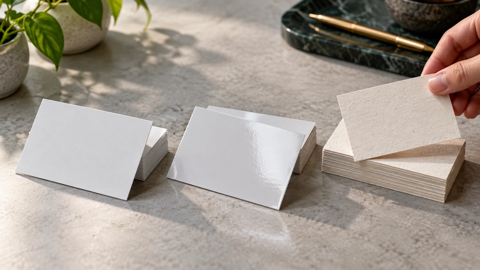
What finish really changes
Finish affects more than reflection. It changes surface feel, colour presentation, finger resistance, writing behaviour and even how thick the card seems. A glossy surface usually makes colours appear sharper and more vivid, but it can also catch strong light and make the piece feel more promotional than corporate. Matte reduces glare and often looks more restrained, while uncoated stock feels softer, drier and more paper-led.
That difference matters because people handle business cards quickly. They do not study printing terminology; they simply register whether the card feels polished, practical, creative or generic. In other words, finish is part of brand communication even before the design is evaluated.
When matte is the safer choice
Matte is often the easiest recommendation for professional service firms, suppliers, consultants and corporate sales teams. It photographs well, resists the overly shiny look that some buyers dislike and usually supports a clean, modern design language. If your card uses moderate colour and typographic hierarchy rather than heavy photography, matte is often the most balanced option.
It is also useful when the card needs to feel current without being experimental. That is why many companies default to it: not because it is the fanciest finish, but because it creates fewer regrets. It tends to sit comfortably between practicality and presentation.
Where glossy and uncoated win
Glossy cards make sense when imagery is doing important work. A product-led business, beauty brand or visually driven promotional card may benefit from the stronger punch that gloss provides. The limitation is that writing on gloss is usually awkward, and fingerprints or glare can become more visible.
Uncoated cards succeed for a different reason. They feel tactile and approachable, and they are much friendlier to handwriting. That makes them useful when recipients may jot appointment notes, product reminders or contact context directly on the card. They also pair well with brands that want a softer, more natural or craft-oriented impression.
A simple buyer checklist
Before approving print, ask four questions. Will anyone need to write on the card? Does the artwork rely on photography or strong image colour? Should the card feel sleek and polished, or more tactile and human? And how does the finish compare with the rest of the stationery set, such as letterheads, folders or brochures?
If those answers point in different directions, make a short sample review rather than guessing. A very small sample comparison can prevent a much larger reprint headache, especially when different team members have different expectations of what “premium” means.
| Finish | Best for | Main limitation |
|---|---|---|
| Matte | Corporate cards, clean modern branding, balanced day-to-day use. | Less colour pop than gloss. |
| Glossy | Image-heavy designs or promotional pieces needing more visual punch. | Harder to write on and more reflective. |
| Uncoated | Natural-feel brands, note-taking, tactile paper-first presentation. | Colours may look softer and less saturated. |
Key Takeaway
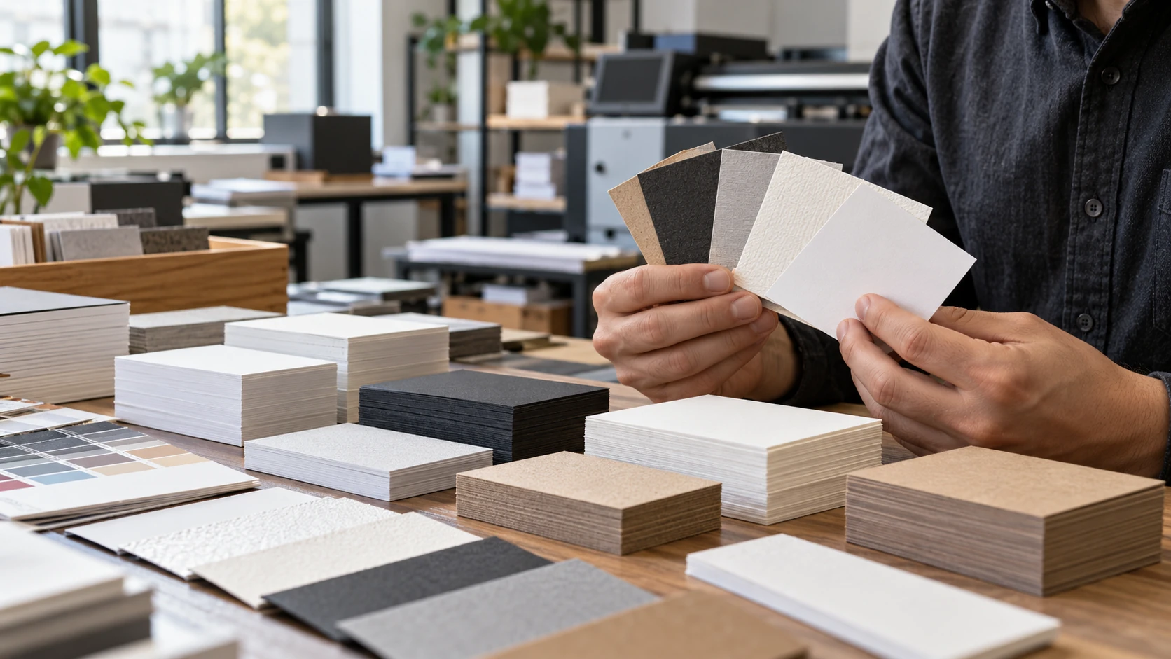
The finish should match the job of the card. If the card is mainly a polished first impression, matte or gloss may win. If it also acts as a practical note card, uncoated often becomes the smarter choice.
FAQ
Is matte always more premium than glossy?
Not always. Matte often feels more understated, but glossy can be the better match for certain visual brands or promotional uses.
Can you write on matte cards?
Usually yes, more easily than on gloss, though the exact result depends on the stock and any coating applied.
Does uncoated mean low quality?
No. Uncoated simply means the surface stays more paper-like. With the right stock, it can feel very refined and intentional.
Comparing paper stocks for your next business card run?
We can help narrow down finish and stock choices so the final card matches both your brand image and practical use.
Contact Us